project

Design of a mobile application for finding experts

ROLE
UX/UI Designer
Process

Research
Survey
Interviews
Competitive analysis
Ideation
Usability Testing
Evaluation

tools
Figma
Balsamiq
Invision
Optimal Workshop
UsabilityHub
time
2019 - 7 months (created)
2025 (redesigned)
Scope
Career Foundry UX Immersion Course
"Have you ever needed expert advice but struggled to find quick, reliable answers?"

Overview

Project Hive is a mobile application that connects users with experts through video calls and messaging. It started as a bootcamp project, which I later refined in 2025 to deepen both the product and visual approach. I designed the user experience as well as the interface, with the goal of making the search for experts simple and reassuring.

Problem statement
Many people struggle to quickly find a trusted expert. The challenge was to design a clear, efficient, and trustworthy application that allows users to book and interact with experts in just a few clicks.

Users and audience
The application targets people seeking professional advice (career, legal, coaching…). Interviews and surveys showed they needed simplicity, speed, and trust-building elements such as ratings, reviews, and transparent profiles.

Roles and responsibilities
I worked alone on this project as a UX/UI Designer. I handled all stages: user research, concept design, visual design, prototyping, and testing.

Scope and constraints

  • Project carried out during a bootcamp, with tight deadlines.
  • Testing conducted remotely on prototypes (no live application).
  • Users included both French and English speakers.
"Have you ever needed expert advice but struggled to find quick, reliable answers?"

The application targets people seeking professional advice (career, legal, coaching…). Interviews and surveys showed they needed simplicity, speed, and trust-building elements such as ratings, reviews, and transparent profiles.

Users and audience

"Have you ever needed expert advice but struggled to find quick, reliable answers?"

Roles and responsibilities

I worked alone on this project as a UX/UI Designer. I handled all stages: user research, concept design, visual design, prototyping, and testing.

"Have you ever needed expert advice but struggled to find quick, reliable answers?"

Scope and constraints

  • Project carried out during a bootcamp, with tight deadlines.
  • Testing conducted remotely on prototypes (no live application).
  • Users included both French and English speakers.
  • Independent work.

Discovery

There is currently a lack of a quick and reliable way for people to connect with experts across various fields when they need personalized advice

This leads to frustration, wasted time searching for answers, and reliance on generic how-to videos that may not address specific needs.

Hive provides a simple way to connect with experts instantly through scheduled video sessions.

Understand

To get a sense of what users might expect from my application, I started by conducting a competitive analysis of two players: CommonGenius and The ONE. This helped me identify the benchmark to aim for and the opportunities I could seize.

CommonGenius

Strengths

- Membership for a lower price
- Easy communication with sharing screens, hosting chat conversations or sending documents
- Recommended experts according to the user's profile

Opportunities

- Adding ratings and reviews for both callers and experts
- Attracting people with everyday problems Improve searching functionalities

Weaknesses

- Focused on professional's career, network
- No web app

Threats

- New apps on the market

TheOne

Strengths

- Free webinars to attract new users
- Price per minute for short advice
- Experts and callers, ratings, reviews
- Credit systems
- Ratings and review system

Opportunities

- Better marketing strategy to increase app awareness
- Develop free chat conversations with experts

Weaknesses

- Mainly focus on the expert instead of people who need advice

Threats

- New apps on the market

Research

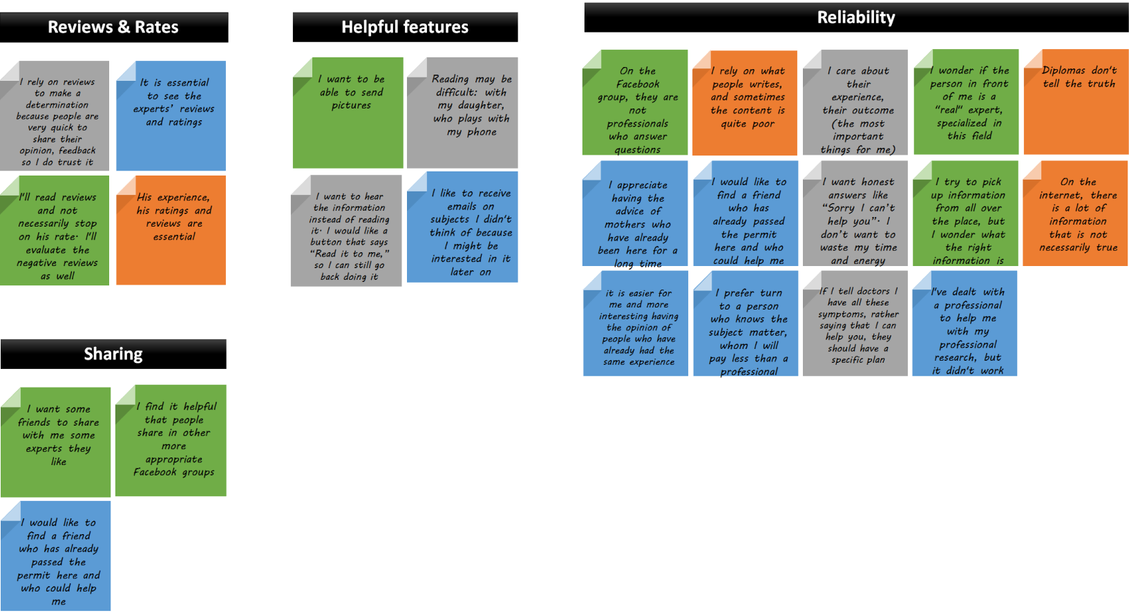
I then conducted a survey to quickly gather insights from a large group of users. After that, I carried out in-person and online interviews. The goal was to understand their frustrations and expectations. I discovered that trust and simplicity were key criteria. The most valuable features identified were instant messaging and video call scheduling.

Survey

Multiple Users 1 Streamline Icon: https://streamlinehq.com
16 participants
Birthday Cake Streamline Icon: https://streamlinehq.com
ages 25-45
Question Help Message Streamline Icon: https://streamlinehq.com
8 questions

Key takeways :

  • Many varied domains of use
  • No particular application or website
  • Instant message and Scheduling a video call interesting
  • Instant video call not interesting

Interviews

Multiple Users 1 Streamline Icon: https://streamlinehq.com
3 participants
Birthday Cake Streamline Icon: https://streamlinehq.com
ages 30–40
Question Help Message Streamline Icon: https://streamlinehq.com
13 questions
After analyzing the notes I had taken and the audio I had recorded, I proceeded to do card sorts and affinity mapping. This part is always fun for me, as it really helps me step into my users shoes. So I sorted only the relevant information and categorized it into specific groups.

Ideation

Based on these insights, I created two personas to highlight their goals and frustrations. I then mapped several user journeys to identify friction points. I chose to work with user flows rather than just a feature list, to keep the overall experience in mind.

Based on interview data, I created two user personas to highlight their goals and frustrations. I then mapped their journeys to understand their thoughts, emotions, and behaviors as they worked toward their goals. Next, I designed user flows to outline the exact steps they would take to achieve them. Finally, I conducted an online open card sorting with OptimalSort to see how users interact with the information in my application and find a better way to organize the application.

Design

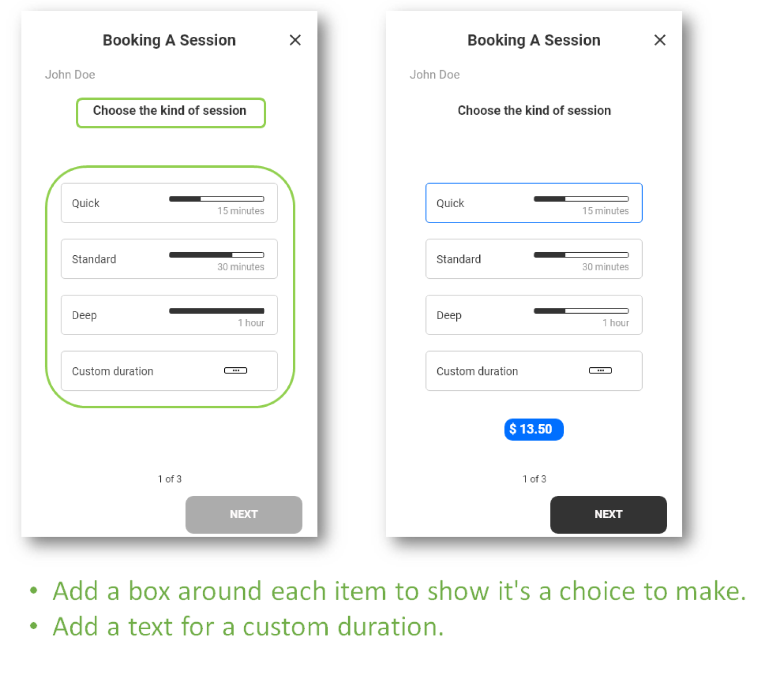
I created low-fidelity wireframes to quickly lay out ideas, followed by a clickable prototype in Figma. I prioritized an incremental approach to test early with users, rather than waiting for a “perfect” version.

With the key features, user flows, and the site map in my hands, I was able to start sketching the first screens of my application, then a mid-fidelity wireframe. Finally I designed my first high-fidelity prototype, in gray- scale, not to distract users with colors during usability testing.

Test

Once the high-fidelity prototype was ready, I conducted moderated remote usability tests to see how well users could complete tasks related to the app’s main features. I identified two major issues that I was able to address and improve.

  • Issues identified: unclear icons, lack of transparency about sessions, and the need for trust-building elements.
  • Solutions: clarified icons, added reviews/ratings, improved presentation of services.

Usability Testing

Multiple Users 1 Streamline Icon: https://streamlinehq.com
6 participants
Birthday Cake Streamline Icon: https://streamlinehq.com
ages 30-40
Checklist Streamline Icon: https://streamlinehq.com
4 tasks
Issue 1: (high severity)
30% got confused between the Home and the Search icons: they did not guess the differences.
Issue 2: (medium severity)
60% wondered whether all experts were displayed in the list of results, and how many people voted for the ratings.

Iterations

Based on usability tests and design best practices, I refined key screens to improve navigation, accessibility and clarity. For example, I updated the content of the home screen and search screen to clearly separate them and added star ratings to provide social proof.
Login
Login
Search results
Search Results
Booking a session
Booking a Session

Redesign

Over the past year, I came back to this project with new skills and a fresh perspective.

What Changed

  • UI Overhaul
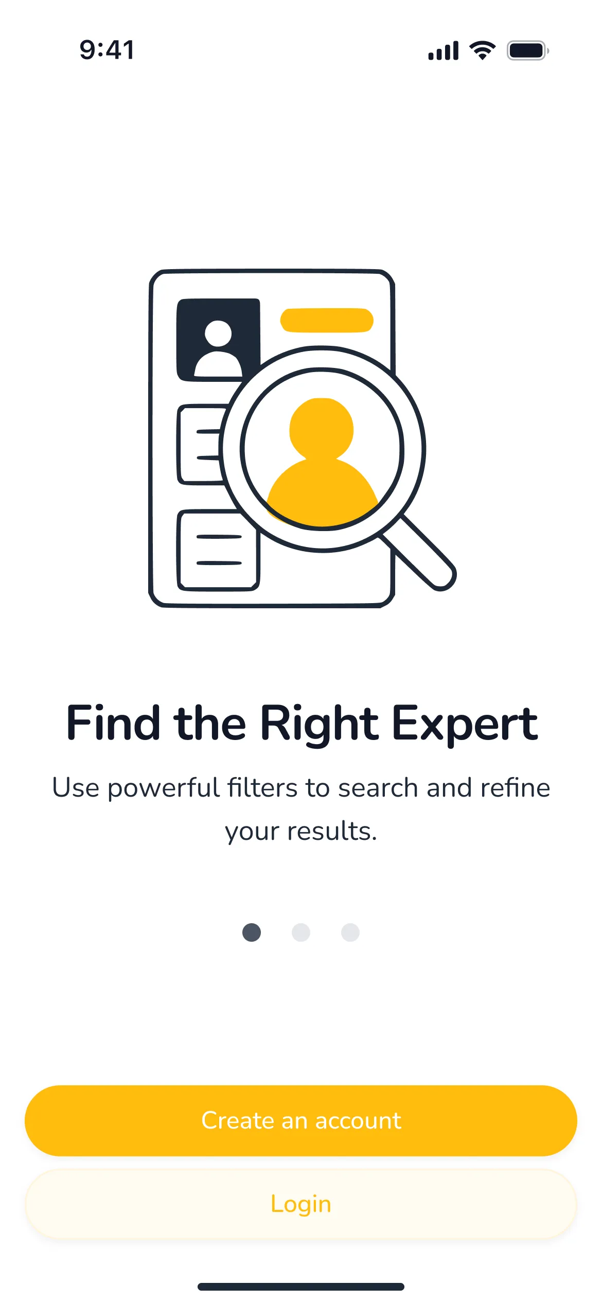
    I redesigned the interface to improve clarity, consistency, and visual impact.
  • New Color Palette
    I went from a subdued blue to a bright yellow and black - inspired by the beehive symbol and name - to create a stronger contrast, personality and brand memorability.
  • Updated Typography
    I chose the Nunito font for better readability and tone.
  • Added Motion Design
    Subtle transitions and micro-interactions were added to support usability and create a more engaging experience.
  • Better Use of Figma
    Leveraged advanced Figma techniques, including a design system, component libraries, auto layout, and prototyping with motion for a smoother dev handoff.

Why I Did It

This project started during a UX immersion course, but after completing several additional courses in UX/UI, Product Design, and Motion Design, I wanted to push my skills further. Rather than starting from scratch, I chose to refine and elevate an existing idea — turning it into a more polished and functional product.

Prototype

What this project taught me…

Thanks to user research, prototyping, and iterative design, Hive became a solution that quickly and effectively connects people with experts. User feedback from usability tests led to key improvements, such as clearer navigation and better transparency about experts.

Although no further testing was conducted after this iteration, the next steps could involve A/B testing and collecting feedback from real users to further refine the experience.
Through user research, prototyping, and iterative design, Hive evolved into a solution that connects people with experts quickly and efficiently. User feedback during usability testing led to key improvements, such as clearer navigation and better expert transparency.

While further testing wasn’t conducted post-iteration, the next steps could involve A/B testing and gathering real-world user insights to refine the experience further.

This project strengthened my UX skills and ability to iterate based on user needs.