project

FamStay web app Design

ROLE
Product Designer
Process

Sitemaps
User Flows
Wireframes
Mood board
Mockups
Usability Test

tools

Figma
Figjam
Whimsical

time
2024
3 months
Scope
UX/UI Design Course by Designership
"Have you ever struggled to find the perfect accommodation with the right filters and information?“

Discovery & Research

Brief Analysis

The founder of Accom.ai personally experienced the challenge of struggling to find a specific accommodation. There is a lack of supportive information and user controls to help traveling couples find suitable getaways in France.

Competitors

Airbnb, Booking.com, Expedia

Target Audience

Couples in their 40s with families seeking unique accommodations in France.

Objective & Constraints

The goal was to design a new web application with key sections: Homepage, Search/Booking, My Bookings, Profile Settings, and Authentication. Given this was version 1, I had to be practical and realistic, considering limited listings (as it was a launch), tight timelines, and available resources.

Brief Analysis

The founder of Accom.ai personally experienced the challenge of struggling to find a specific accommodation. There is a lack of supportive information and user controls to help traveling couples find suitable getaways in France.

Competitors

Airbnb, Booking.com, Expedia

Target Audience

Couples in their 40s with families seeking unique accommodations in France.

Objective & Constraints

The goal was to design a new web application with key sections: Homepage, Search/Booking, My Bookings, Profile Settings, and Authentication. Given this was Version 1, I had to be practical and realistic, considering limited listings (as it was a launch), tight timelines, and available resources.

Ideation

Creating a sitemap helped me ensure I fully understood the brief and had a clear picture of the web app. Guided by the job stories given in the brief, I mapped out the structure, including the key pages and how they connect. From this structure, I then created a user flow, representing the paths users take to make a booking based on the job stories. For both I used Figjam.

Design

Wireframes

To create the wireframes in Whimsical, I looked at the sitemap, the user flow, and checked how competitors were doing things. It gave me an idea of what to expect from an accommodation booking platform, and some inspiration.
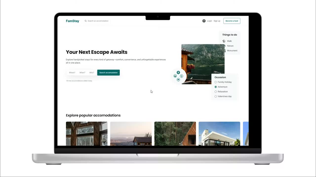
Mood board (Lean Branding)

For the visual design, I focused on the brand’s identity I wanted to give, the values, and the audience. Here is what I chose:

We are: Authentic, Reliable, Inspiring.

We are not: Inconsiderate, Mediocre, Untrustworthy.

Target audience: Couples in their 40s with families in France who struggle to find suitable accommodations.

I chose dark teal because it combines blue (trust, reliability) and green (growth, balance, authenticity), creating a calm and confident feel.

I created two color palettes:

  • Primary palette – Used for navigation, buttons, forms, and key actions.
  • Grey palette – Used for text and backgrounds.

Mockups

I created high-fidelity mock-ups with visual design in mind. You can see several pages here.

Test

Once the high-fidelity prototype was ready, I conducted moderated remote usability testing to evaluate how well users could complete tasks related to the key features of the application. I was able to identify two major problems which I was able to work on and improve.

Test

Usability Testing

Since this was the first version (MVP), the goal was to validate key aspects of the product, especially the homepage messaging and the search listings page filters. The homepage needed to be compelling enough to attract users, while the search experience had to be intuitive and efficient.

To achieve this, I conducted moderated, in-person usability tests, where participants completed three key tasks while I observed and took notes, gathering insights to improve the design.
I can see I could search by occasion, which is great.
I’m not sure about the price… Is it per night or total?
I don’t know what this person icon means on the map…
Login
Search Results
Multiple Users 1 Streamline Icon: https://streamlinehq.com
6 participants
Birthday Cake Streamline Icon: https://streamlinehq.com
ages 30-40
Checklist Streamline Icon: https://streamlinehq.com
4 Tasks

Iterations

User feedback was minor but valuable. Here’s what I changed:

- Pricing clarity: Displayed both total price and per night price to avoid confusion.
- Activity icon update: Changed the generic person icon to a hiking icon (backpack & stick) for better clarity.
- Filter hierarchy: Adjusted the order from “Occasion, Price, Style, Activities available” to “Occasion, Style, Price, Activities available” as users associated Style with Occasion, which influenced price.
Login
Search Results

Prototype

What this project taught me…

This project taught me how to design with real-world constraints, especially when building an MVP with limited listings. I learned to prioritize features carefully and saw how small UI changes—like adding a map showing both accommodation locations and nearby activities (walking trails, nature spots, etc.)—can help customers make better decisions. Following a structured UX/UI process gave me a solid foundation for future projects.

Medium length hero heading goes here

Lorem ipsum dolor sit amet, consectetur adipiscing elit. Suspendisse varius enim in eros elementum tristique. Duis cursus, mi quis viverra ornare, eros dolor interdum nulla, ut commodo diam libero vitae erat.

By clicking Sign Up you're confirming that you agree with our Terms and Conditions.
Thank you! Your submission has been received!
Oops! Something went wrong while submitting the form.