

Simplifying e-commerce journeys across multiple user profiles
This project involved designing an e-commerce platform serving multiple user profiles, each with different permissions and product access rules.
The challenge was to simplify user journeys, clarify product restrictions, and create a coherent experience despite a wide variety of usage scenarios.
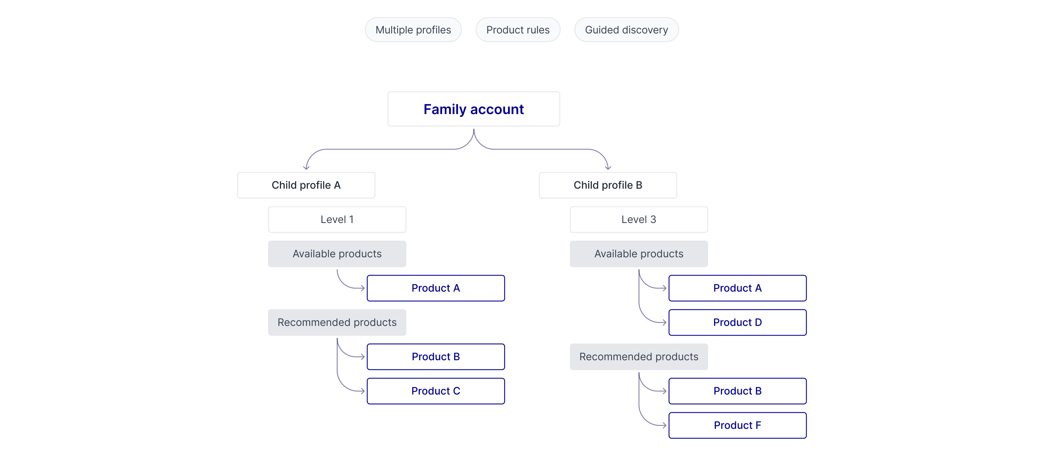

Clarifying information hierarchy
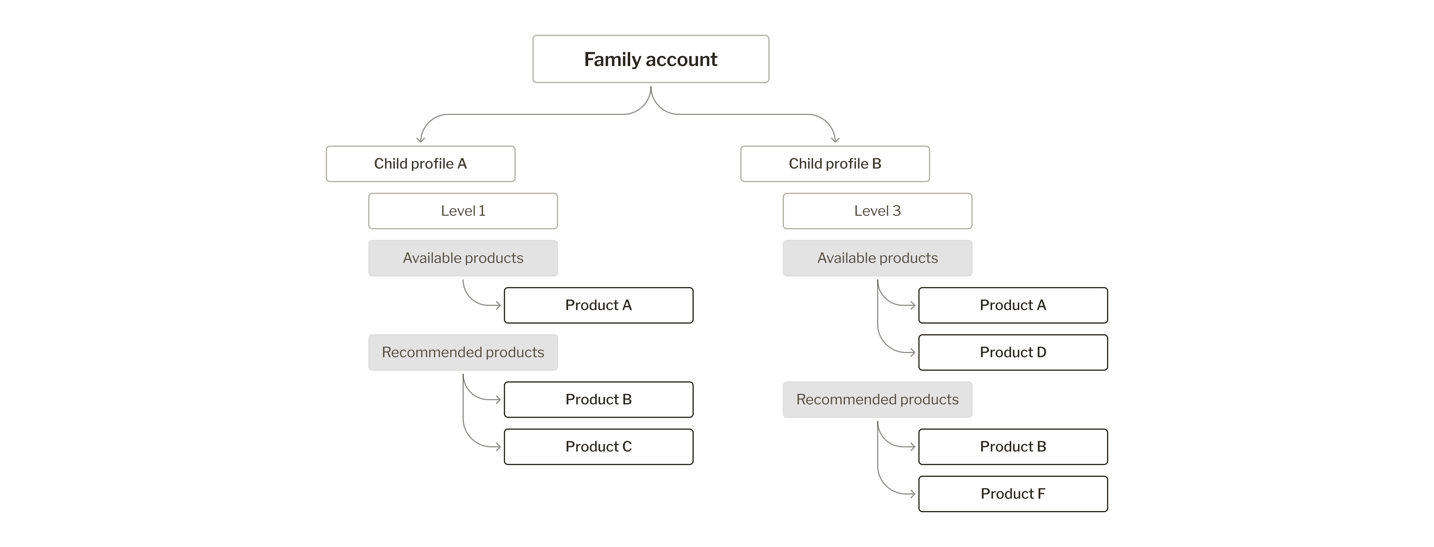
Key Results
- Made complex product access rules easier to understand.
- Created journeys adapted to different user profiles while maintaining consistency.
- Improved product discoverability through guided navigation.
- Balanced business requirements with user needs across the platform.
Challenges
Multiple user profiles with different permissions
Product visibility depending on business rules
Complex relationships between accounts and users
Need to guide users toward relevant products despite access restrictions
My Role
I worked closely with the Product Owner to transform complex rules (access rights, family accounts, special cases for professionals) into a single, easy-to-follow experience. When a rule was too difficult to explain to users, I discussed it with the PO to see whether we could simplify it, rather than just making it easier to read on the screen.
Responsibilities
- UX/UI Design
- Product discovery experience
- Product access clarification
- User journeys and workflows
Context
An e-commerce experience with specific access rules. The platform was designed to enable:
- the purchase of equipment and products related to the sport
- access to certain products based on progress or skill level
The catalog had to achieve two goals at once:
- help very different user groups (families, professionals) quickly understand what was available to them,
- remain an effective sales tool for the company (highlighting products, promotions, and cross-selling).
If the catalog remained confusing, users might be discouraged from making a purchase, and the company risked losing the very sales it was trying to boost.
Exploration
The project began with an initial understanding of the product, user needs, and key features.
Throughout the wireflow proposals and discussions with the Product Owner, several issues were clarified and refined.
Exploration
- Understanding key business rules
- Identification of special cases
- Analysis of different user profiles
- Progressive clarification of user journeys
Findings
Insights
- why a product is unavailable
- how to unlock it
- what action to take next


Design
Make product rules clear
Problem
Some access rules could be difficult for users to understand, particularly when products were locked or subject to specific conditions.
Product Decision
- Add explanations for locked products
- Clarify the different user statuses
- Reveal necessary information gradually
Expected Result
Make restrictions easier to understand and guide users toward the desired action.

Personalizing the user experience based on user profiles
Problem
User needs and journeys varied depending on user profiles, family accounts, and professional use cases.
Product Decision
- Management of family accounts for multiple users
- Accommodation of specific professional workflows
- Synchronization with the user’s personal space
Expected Result
Deliver an experience tailored to different use cases while maintaining a consistent structure.

Making it easier to discover products
Problem
User needs and journeys varied depending on user profiles, family accounts, and professional use cases.
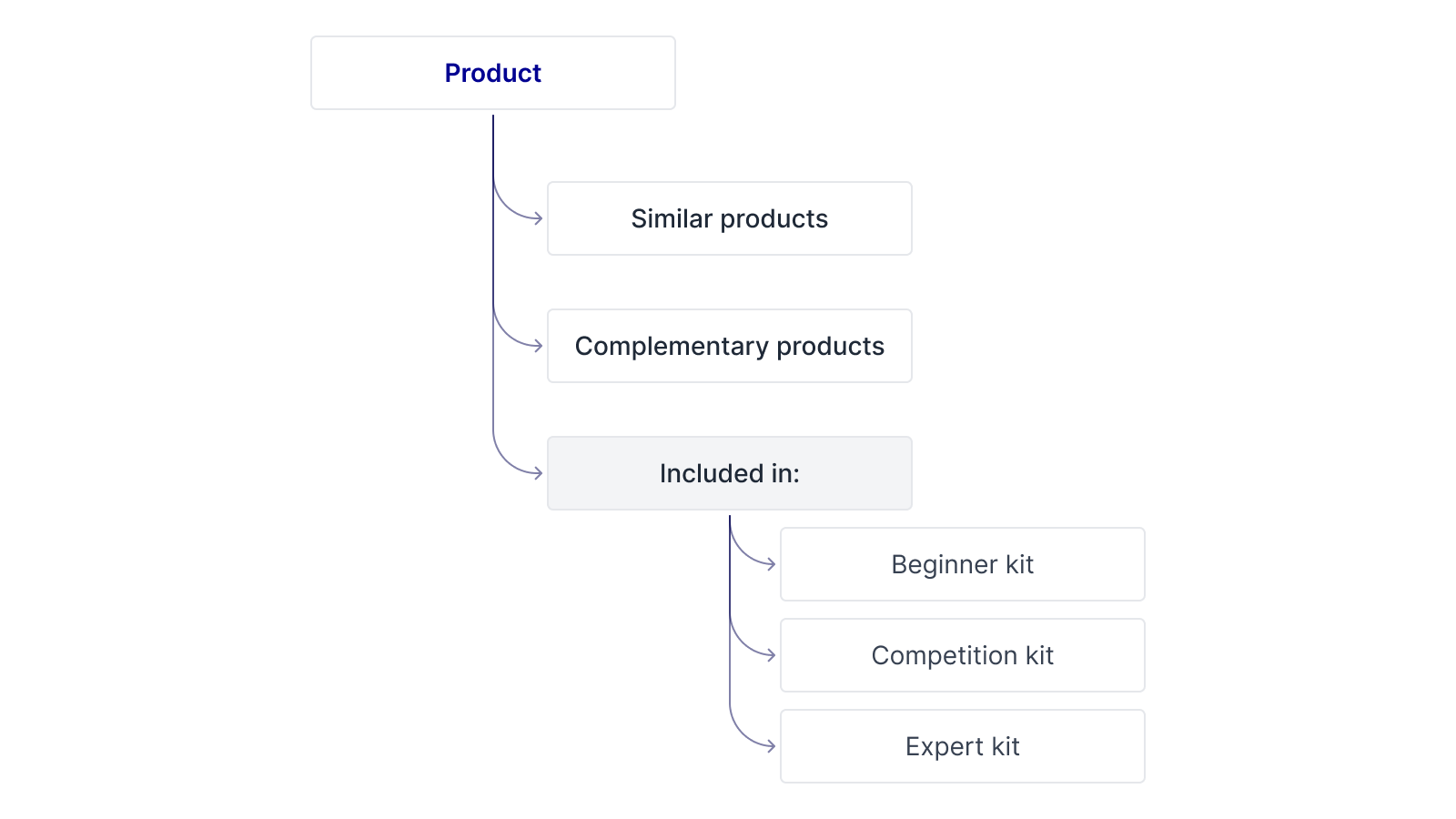
A feature to highlight products was integrated into the catalog and product pages:
The catalog needed to do more than just allow users to search for products; it also needed to guide users in their product discovery and help meet product objectives.
Product Decision
Highlight featured products, banners, and related products, as requested by the PO, but without overloading the navigation or overwhelming the user with unnecessary suggestions.
Expected Result
Make it easier to discover products and create more visible connections between products.
Constraints & Trade-offs
Users didn’t need to understand the entire product logic.
The experience was designed to display only the information that matters:
- why a product is unavailable
- how to access it
- what to do next
Objective:
- simplify user flows
- make the rules easier to understand
Conclusion
- Access rules that are easier to understand, without overwhelming the user with business-specific details
- A single user experience for very different user profiles, without creating multiple versions of the product
- A catalog that truly helps users discover products and also supports the company’s business objectives
- Decisions made in collaboration with the Product Owner that will guide future development
Conclusion
I don't have access to sales data or user behavior after launch. If I had access to that data, I would look at:
- the click-through rate for featured products,
- the bounce rate on locked product pages,
- the time it takes for each user profile to add a product to the cart.
Lessons Learned
This project reminded me that complexity is not always visible.
While the interface appeared straightforward, much of the challenge came from understanding business rules, user permissions, and product relationships behind the scenes.
Designing the right experience required making these rules understandable without overwhelming users.