
Clarifying workflows and data organization in a complex industrial tool
Business software is used in industrial settings to manage data, perform technical processes, and streamline complex workflows.
The project aimed to improve the user experience, navigation, and data organization, while maintaining the advanced features required by expert users.

Key Results
- Consistent data organization across teams
- Clarified information hierarchy
- Smoother and more intuitive workflows
- Positive feedback on the direction from key users
Context
The software is used in a technical and industrial environment that requires the management of large amounts of data and specialized processing.
The product was primarily used by experienced users who had developed their own habits and conventions over time.
The goal of the project was not to simplify the tool, but to make user flows more understandable, more consistent, and easier to maintain across teams.
problem
Users had difficulty:
- understanding how projects were organized,
- tracking work in progress,
- quickly finding important data,
- and taking over projects from other teams.
Over time, experienced users had developed their own standards and methods to work around certain limitations of the product.
This led to:
- inconsistent project structures,
- heavy reliance on searching by name,
- workflows that were difficult to follow,
- complex navigation,
- and a more difficult learning curve for new users.
Identified problems
Discovery
Before beginning user research, a discovery phase was conducted to understand how the product works, the existing workflows, and the key business constraints.
The Product
- Product presentation by stakeholders
- Analysis of the product’s main areas
- Understanding business constraints
Workflows
- Demonstrations by expert users
- Observation of existing workflows
- Analysis of usage patterns
Early observations


User Research & UX Analysis
The research aimed to understand how users:
- organized their data,
- navigated workflows,
- located important information,
- and worked around some of the product’s limitations.
The goal was also to identify:
- the basic needs of expert users,
- constraints related to technical workflows,
- and the limits of simplification possible in this type of business environment.
Research, Analysis, and Collaboration
- 7 qualitative interviews
- Observation of user journeys
- Analysis of recurring issues
- Summary of user feedback
- UX Audit
- Competitive Analysis
- Identification of recurring issues
- Prioritization of UX issues
- Workshops with stakeholders and key users
- Collaborative work on data organization and workflows
- Regular reviews of UX proposals
Use of AI
Generative AI tools were used to accelerate certain stages of:
- interview preparation,
- summary of user feedback,
- and UX exploration.
UX decisions continued to be based on:
- user feedback,
- observation of real-world user journeys,
- business requirements,
- and the product’s technical constraints.
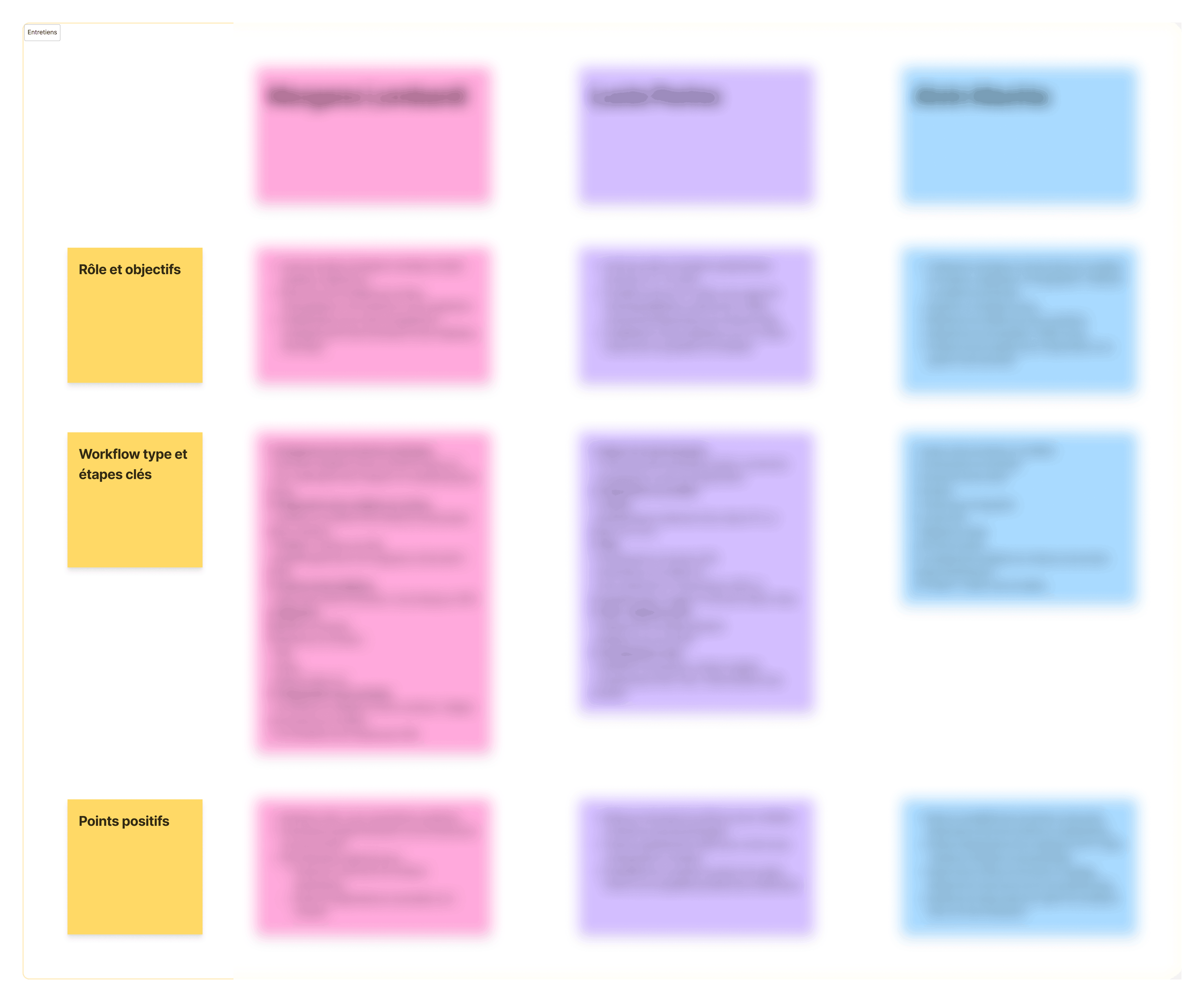
User interviews
Qualitative interviews conducted with geophysicists and project managers to understand their daily workflows, their data organization methods, and the main challenges they faced with the software.
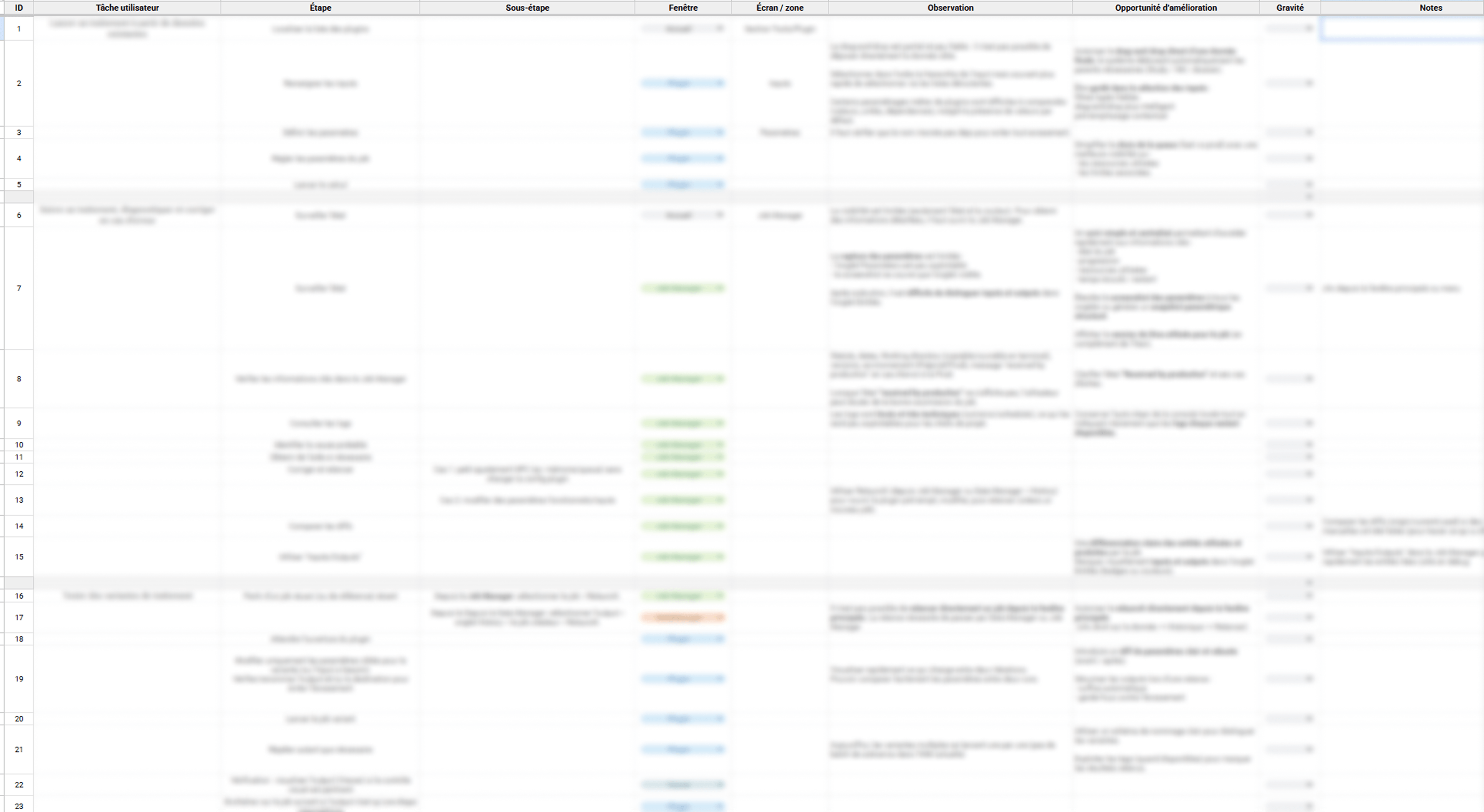
UX Audit
To better understand existing user journeys, a detailed UX audit was conducted to map out:
- user tasks,
- critical steps,
- pain points,
- and opportunities for improvement.
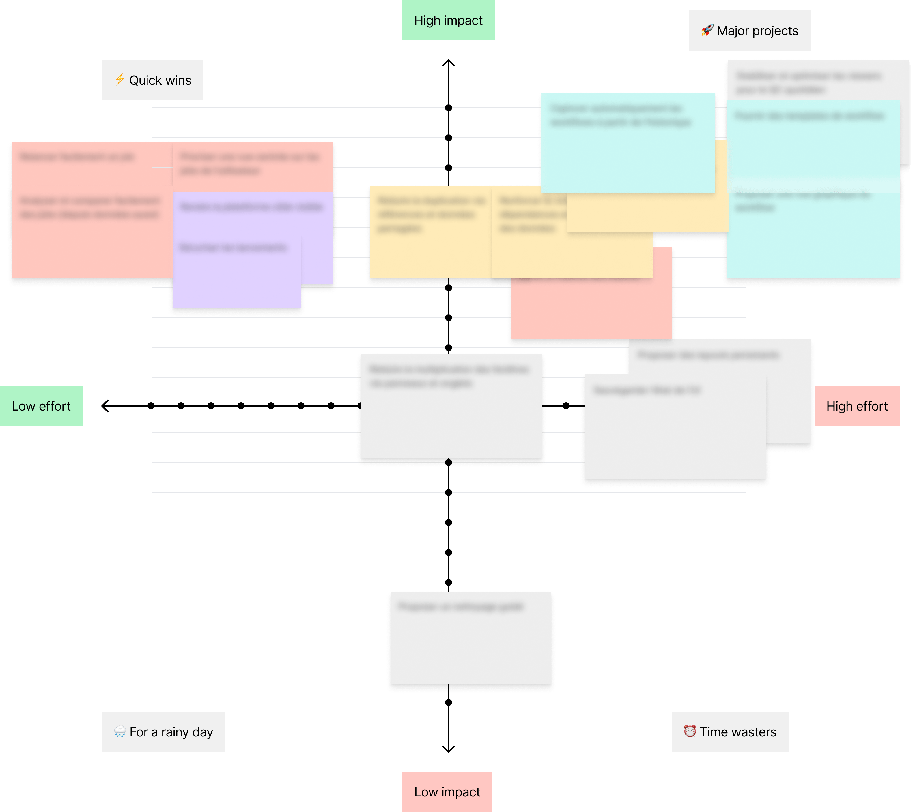
UX & Product Prioritization
The issues identified during user research and the UX audit were prioritized based on their impact on users and the effort required to implement them.
This step made it possible to:
- align UX priorities with product and technical constraints,
- identify the most critical improvements,
- and structure future product updates in a phased manner.
Key insights
Workshop
A workshop was conducted with stakeholders (experienced users and the development manager) to collectively brainstorm a clearer and more consistent structure for projects within the software.
Goals
- align usage practices,
- reduce inconsistencies between teams,
- clarify user flows,
- and define more understandable organizational principles.
Outcomes
- a new data structure,
- common usage conventions,
- shared organizational rules,
- and several proposed features to improve navigation and project understanding.
Design
The goal was not to reduce the density of information, but to better structure user flows and improve the product’s overall readability.
Separating information layers
Problem
Navigation, workflows, and technical details were often mixed together in the same spaces, making user journeys difficult to follow.
UX Decision
The interface was restructured around multi-panel layouts to better distinguish between:
- navigation,
- workflows,
- contextual actions,
- and technical details.
Expected Result
Reduce cognitive load and allow users to keep a clearer view of their active task without losing quick access to advanced features.


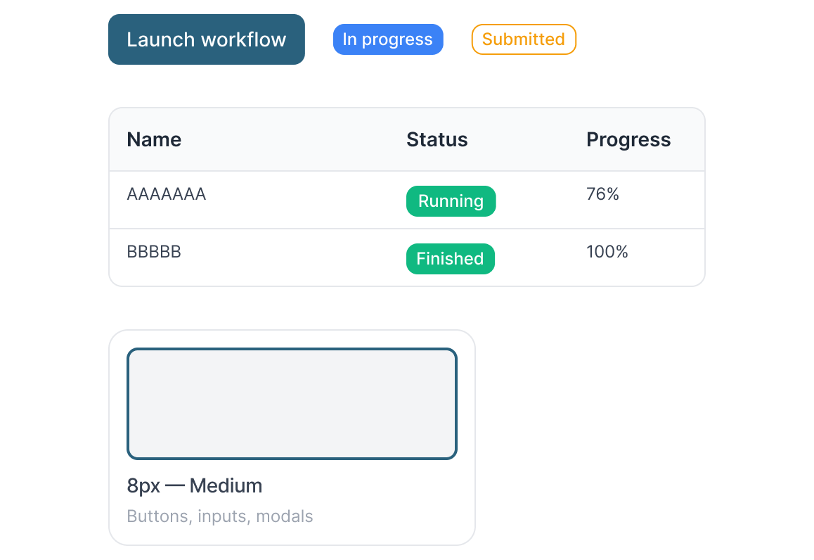
Structuring a more comprehensive workflow experience
Problem
The workflow feature was under development, and several ideas had already been explored regarding templates, workflow execution, and tracking. However, the user experience remained very limited: basic interfaces, restricted interactions, and workflows that were difficult to understand as a whole.
UX Decision
The redesign focused on structuring a more comprehensive and consistent experience around:
- the creation and editing of templates,
- and the launch and tracking of executed workflows.
User flows were defined to clarify interactions and connect the module’s various steps.
Particular attention was also given to:
- the clarity of the steps,
- the management of parallel workflows,
- and clarifying the execution context.
xpected Result
Create a clearer and more consistent experience around workflows while still providing the advanced features needed by expert users.

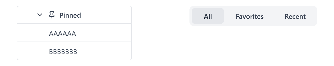
Easy access to important items
Problem
Users were wasting time trying to find certain frequently used data or tools.
UX Decision
Simple “Pinned Data” and “Favorite Tools” features were introduced to speed up access to important elements of the workflow.
Expected Result
Reduce repetitive tasks and facilitate quick access to the most frequently used items.
Improving interface consistency
Problem
Behaviors and screen layouts were sometimes inconsistent across the product’s different areas.
UX Decision
UI guidelines were defined to harmonize:
- components,
- behaviors,
- typographic hierarchy,
- and layout structures.
Expected Result
Create a more consistent, more readable interface that is easier to scale over time.
Constraints & Trade-offs
The project had to integrate with:
- an existing application,
- complex technical user flows,
- and strong development constraints.
Some UX decisions were therefore guided by:
- preserving expert workflows,
- maintaining a high level of user control,
- time and budget constraints,
- and avoiding overly extensive technical redevelopment.
Example of a UX Trade-off
A simple representation of workflows was chosen over a “graph editor”-style system, which would have been more complex to develop, maintain, and integrate into the existing system.
The goal was to find a balance between:
- readability,
- user efficiency,
- and technical feasibility.
Lessons Learned
This project taught me that improving a complex business tool is not about reducing the density of information, but rather about:
- better structuring user flows,
- clarifying levels of information,
- and keeping certain features for expert users.
It also reinforced the importance of:
- observing actual usage patterns before simplifying an interface,
- collaborating closely with expert users and technical teams,
- and designing solutions tailored to the real constraints of the existing product.
Conclusion
The project resulted in:
- clarifying the main issues related to data organization and workflows,
- proposing a more consistent structure across teams,
- formalizing UX/UI recommendations,
- and defining a common foundation for future product developments.
Deliverables included:
- summaries of the research and user interviews,
- user journeys,
- UX recommendations,
- interface concepts,
- and UI guidelines.
The final mockups were presented to stakeholders and several key users during a debriefing session.
Feedback was particularly positive regarding:
- the readability of the screens,
- the organization of data,
- the relevance of certain proposed features,
- and the clearer separation of information levels.
The client then remained responsible for prioritizing and developing the proposals that had been created.